PANTONE: OFFICIAL COLOURS FOR SPRING / SUMMER 2019 & HOW TO WEAR THEM!

With the commencement of London Fashion Week, comes the announcement of Pantone’s infamous Colour Report, this time unveiling S/S19’s more desirable colours.
If you’re not familiar with Pantone’s Colour Report, it features a definitive collection of colours we’ll all be wanting to wear come spring. Fashion and interior designers are inspired by these curated shades, and by this time next year, chances are our wardrobes and homes will be filled with these hues.
So whether you’re looking to stay ahead of the game, or simply curious to see exactly what shades you’ll want to be stocking up on, here’s our own report on Pantone’s Spring / Summer 2019 colours, and how to wear them!
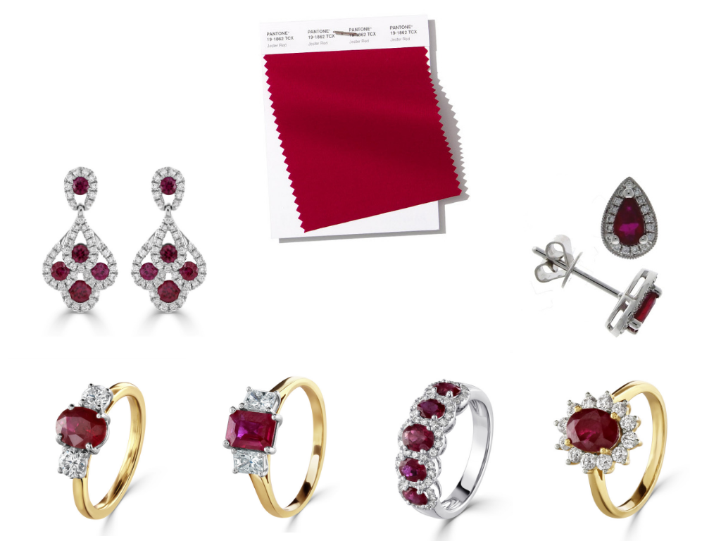
PANTONE 19-1862 JESTER RED
The perfect transitional shade to say goodbye to winter and welcome us into the New Year, Jester Red is a wonderful burgundy red that’s timeless and versatile.
Ruby and Garnet jewellery make wonderful choices to reflect this shade in your spring looks. We have a beautiful selection of pieces featuring each of these stones, which will add a pop of colour and a touch of romance to your ensembles.
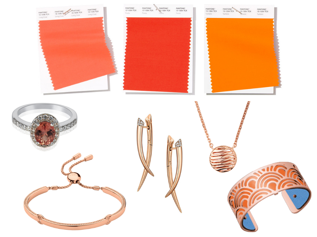
PANTONE 15-1264 TURMERIC / PANTONE 17-1564 FIESTA / PANTONE 16-1546 LIVING CORAL
2018 has been all about bold colours, and it seems that they’re set to stay! It’s time to add a touch of the tropics into your looks this spring, with Orange hues featuring heavily in Pantone’s S/S19 line up!
Popularised by Princess Eugenie’s engagement ring, the fiery colour of Padparadscha Sapphires are a fantastic choice to incorporate a splash of tangerine into your looks. But if you’re not entirely sold on orange gemstones, then heat up your outfits with a melting mix of rose gold metals. Warm toned and universally flattering, rose gold can be an affordable way of keeping your jewellery box up to date for spring.
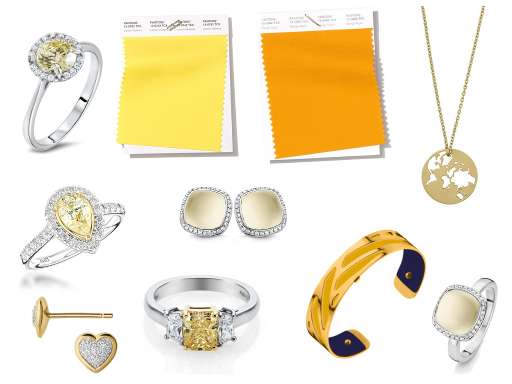
PANTONE 12-0742 LEMON VERBENA / PANTONE 15-0960 MANGO MOJITO
Fresh, zesty and the perfect antidote to brightening up chilly spring mornings, yellow hues are going to very much so be a wardrobe staple. Decidedly more difficult to wear, if you’re feeling a little overwhelmed at the prospect of wearing yellow, then you can always easily incorporate yellow gold jewellery instead. Timeless, versatile and perfectly on trend, there’s a whole host of new yellow gold designs in store for you to embrace.
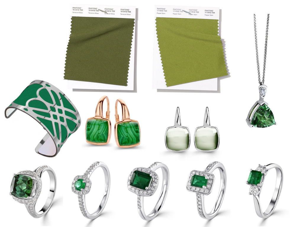
PANTONE 17-0542 PEPPER STEM / PANTONE 18-0416 TERRARIUM MOSS
With a new year bringing resolutions promising health kicks and gym memberships, it seems only natural that Pantone would feature shades of green in their spring mix. Following the trend of bright hues, Pantone have chosen striking hues which can beautifully be reflected in emerald gemstone jewellery.
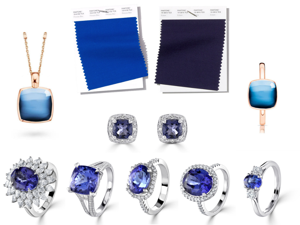
PANTONE 19-4150 PRINCESS BLUE/ PANTONE 19-3810 ECLIPSE
There’s no need to feel January blues next year, unless you’re wearing them! Pantone have picked a stunning shade of cobalt blue, and a navy blue to create striking contrast. Sport these stunning shades with ease by choosing to wear sapphire or tanzanite gemstone jewellery – both make wonderful choices for Spring!
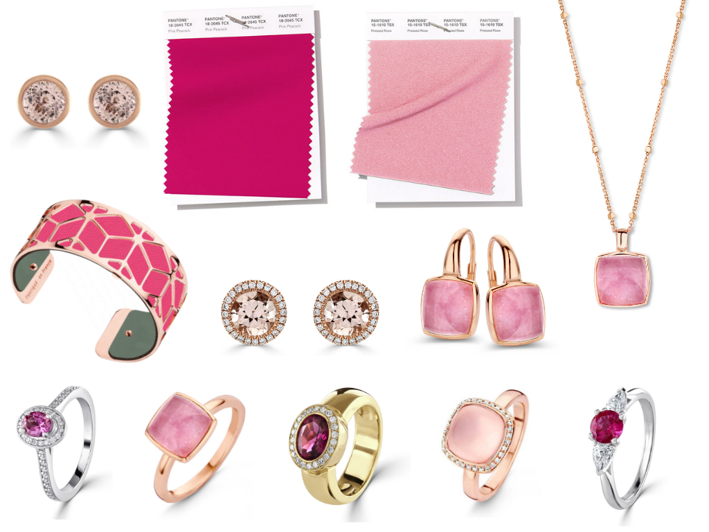
PANTONE 18-2045 PINK PEACOCK / PANTONE 15-1619 PRESSED ROSE
Feminine and flirtatious, it wouldn’t be a Pantone colour report without at least one shade of pink, and this coming Spring we’ll be lucky enough to be able to embrace two contrasting shades! A soft dusty pink, and a vibrant hot pink shade can be incorporated into your looks with rose quartz or tourmaline jewellery. Whichever you decide to try out next year, you’ll find a luxurious selection of designs and styles in store.